3D Visualization of Your Data Ecosystem - Digital Twin
Transform your pipeline into a living, interactive 3D digital twin. See how data flows in real-time, spot failures instantly, and understand your ecosystem like never before.
Why Traditional Lineage Falls Short
Most lineage tools show a flat 2D diagram. It's clear, but it's static. It doesn't show what's happening right now.
- No sense of scale — can't tell if 100 or 100M rows are flowing
- No temporal dimension — doesn't show what's running vs. what ran yesterday
- No health status — all nodes look the same whether healthy or broken
- Hard to explore — 50+ nodes become impossible to navigate
- No pattern recognition — visual patterns are lost in flatness
3D visualization solves all of these.
What is 3D Visualization?
3D renders your data ecosystem as an interactive three-dimensional space where:
- Nodes are positioned in 3D space
- Links are tubes showing data flow
- Color encodes status (green=healthy, red=failed, amber=running)
- Size represents throughput (bigger = more data)
- Animation shows data flowing in real-time
What is a Digital Twin?
A Digital Twin is a real-time virtual replica of your data ecosystem — not a diagram of how it should work, but a live mirror of how it's working right now.
| Aspect | Traditional | Digital Twin |
|---|---|---|
| Updates | Daily | Every 60 seconds |
| Shows | Yesterday | Right now |
| Colors | All same | Green/Red/Amber status |
| Size | Static | Data volume/throughput |
| Failures | Hours later | Instantly (red nodes) |
Digital Twin in Action
See how the Digital Twin responds to different states of your data ecosystem. Each animation shows real-time encoding of pipeline status:
🟢 Healthy Pipeline
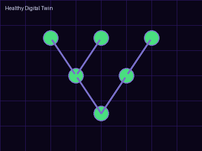
All systems operational. Green nodes indicate healthy jobs, flowing data particles show active pipelines. Everything synced and ready.
⚡ Jobs Running
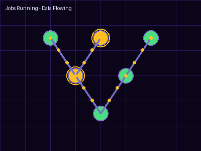
Amber pulses show active job execution. Multiple particles animate simultaneously, showing heavy data throughput. Fast, responsive feedback.
🔴 Failure Detected
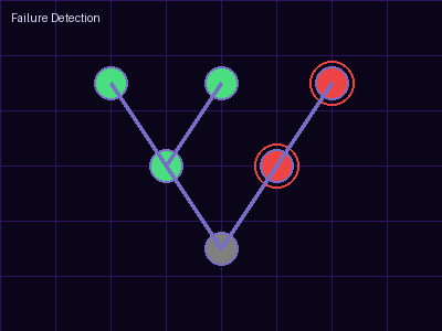
Red pulsing nodes instantly signal failures. Downstream nodes darken, showing impact cascade. No logs needed — visual urgency is immediate.
💡 Key Insight
The Digital Twin encodes every state visually: color for status (green/amber/red), size for volume, animation for flow direction, and position in 3D space for relationships. Your brain processes these patterns faster than reading any report.
Real Benefits of 3D
See Patterns Instantly
Bottlenecks, single points of failure, and over-engineered paths become obvious. What takes 10 minutes to understand in a spreadsheet takes 10 seconds in 3D.
Detect Failures Visually
A red node screams "broken" across the screen. Your brain processes visual color faster than reading error messages.
Understand Data Volume
Size encodes flow. Big nodes = busy pipelines. Thick links = data waterfall. Visual metaphors beat metrics tables.
Prioritize Fixes
3D instantly shows which failures have the widest blast radius. Fix the most impactful broken node first.
Faster Debugging
Dashboard broken → see the root cause → 5 minutes. Without 3D → 1+ hours hunting logs.
Real-World Use Cases
🚨 Incident Response
Problem: Revenue dashboard down
Traditional (1+ hour): Check Tableau → Snowflake → dbt logs → Fivetran → finally see Fivetran failed
Digital Twin (5 min): Open Twin → see 🔴 Fivetran → click → see error → contact Salesforce support
📊 Capacity Planning
In 3D, you instantly see:
- Which nodes are swollen (high throughput)
- Which links are thick (heavy data movement)
- Which areas have slow animation (bottlenecks)
Size infrastructure confidently for Q4 before problems hit.
👥 Onboarding
New engineer joins. Instead of 2 hours of explanation:
- Open the Digital Twin
- See the entire pipeline at a glance
- Rotate and explore sections
- Within 30 minutes, they understand the ecosystem
Ready to See Your Data in 3D?
MyDo.io gives you both 2D and 3D visualization. See your pipeline live, detect failures instantly, understand your ecosystem at a glance.
- ✅ Real-time 3D & 2D graphs
- ✅ Live job status
- ✅ Replay past executions
- ✅ 165+ connectors
Why 3D Matters Now
Pipelines have gotten exponentially more complex. In 2015, 10 nodes was large. Today, 100 nodes is common. A 2D diagram of 100 nodes is just noise.
3D isn't a gimmick — it's essential for managing modern stacks. Your brain is wired for spatial reasoning. Use it. Let 3D encode the complexity so you see patterns your eyes would miss in a spreadsheet.
A Digital Twin isn't just pretty — it's productive.